Werewolf Part 2#
In chapter 1 we looked at a simple layout for a set of cards for Werewolf. This chapter will continue working on those cards.
The Rect Element#
CLS offers some limited elements for drawing shapes. We’ll be looking at rect but there’s also circle and line. Shapes are great for placeholders until you get final graphics, simple layouts, or colorizing transparent images. The color of the shape and the line used to draw the shapes are also fairly flexible, check out the section on Element Shapes for more.
So, let’s look at a simple border.
role-border {
    type: rect
    position: center, .5in
    size: 1.5in, .25in
    corner-radius: .1in
}
Pretty easy! We give it the same position and size as the role element so it fits, and the corner-radius property rounds the corners slightly. Just put this before the role section and let’s take a look

Looks good, but there’s a problem. Because we put the same size and position in two places, if we want to move the role we have to change things in two places. We can fix that by putting the elements in a container.
role-container {
    position: center, .5in
    size: 1.5in, .25in

    border {
        type: rect
        size: 100%, 100%
        corner-radius: .1in
    }

    role {
        type: text
        size: 100%, 100%
        font: 12pt, Palatino Linotype
        font-color: [if| [eq| [role], werewolf], [dark-red], black]

        align: center, middle
        text: [capitalize, [role]]
    }
}
A container is any element that holds another element, as shown. An element in another element is a subelement. If an element has no other container then the layout can be thought of its container. Any element can be a container, but elements without types are recommended. Containers affect their subelements in a few ways
The position of a subelement is based on the location and rotation of its container.
When the size of a subelement is given as a percent its size is proportional to its container
Subelements are drawn after their container.
This gives us the benefit of separation of concerns, which is programmer talk for “different things in different places, so separate things can do the same thing”. You don’t have to put everything in a container, but when you have multiple elements of the same size at the same place containers certainly help. Other places you might want to use a container.
position one element relative to another.
a set of elements that will always be next to each other, but don’t have a final position
you want to define a size as a percent of another element’s size
Inverse Position#
While we’re on the subject of positioning, let’s talk inverse positions. Normally, positions are based on the upper left, where a given element’s upper left is relative to its container’s upper left. Some times you want to position an element based on its lower or right edge. This is the purpose of inverse positioning. We’ll look at this by adding a description of the role to the bottom of the cards.
description {
    type: text
    position: center, ^.5in
    size: 2in, .5in
    font: 10pt, Palatino Linotype
    align: center, middle
    text: [description]
}

data {
repeat, role, description
2, werewolf, You may kill one player per night.
1, seer, You may find out the role of one player per night.
4, villager, You have no abilities.
}
An inverse position is indicated with a caret before the number. In this case the description will have it’s bottom a half inch from the bottom of the card. Inverse Positions can be mixed with normal positions to specify any corner, such as position: ^.25in, 25in to specify a quarter inch from the upper right corner.
Let’s take a look then we’ll go over a few final points.
Neat!
The Defaults Section#
Because our two text boxes use the same font, we can make use of the defaults section.
defaults {
    font-family: Palatino Linotype
}
The defaults section sets default values for every element in the layout. Any property can be defined in the defaults section, even size and position. This is handy any time multiple elements use the same value and you only want to define it in one spot.
Image Positioning#
Images can be a little weird to position. We have a simple example and our images are about the same size so there isn’t much to do. For more complex positioning of images of different sizes, use an image-box element. It works like an image element, with an added align property paired with a defined size to position images within that size. Check it out here to familiarize yourself with it, and how the image element works.
Last Look at the Cards#
Finally, here’s everything all together.
layout {
    size: 2.5in, 3.5in
}

export {
    destination: cards
    bulk {
        name: [role][repeat-index].png
    }
}

macros {
    dark-red = #a32b1d
}

defaults {
    font-family: Palatino Linotype
}

role-container {
    position: center, .5in
    size: 1.5in, .25in

    border {
        type: rect
        size: 100%, 100%
        corner-radius: .1in
    }

    role {
        type: text
        size: 100%, 100%
        font-size: 12pt
        font-color: [if| [eq| [role], werewolf], [dark-red], black]

        align: center, middle
        text: [capitalize, [role]]
    }
}

icon {
    type: image
    position: center, 1in
    source: images/[role].png
}

description {
    type: text
    position: center, ^.5in
    size: 2in, .5in
    font-size: 10pt
    align: center, middle
    text: [description]
}

data {
repeat, role, description
2, werewolf, You may kill one player per night.
1, seer, You may find out the role of one player per night.
4, villager, You have no abilities.
}
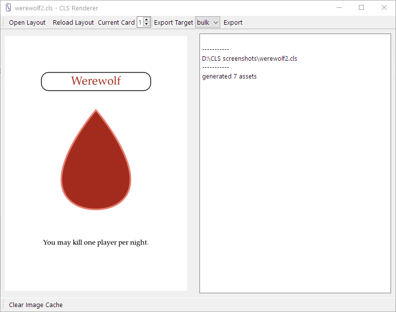
And the cards
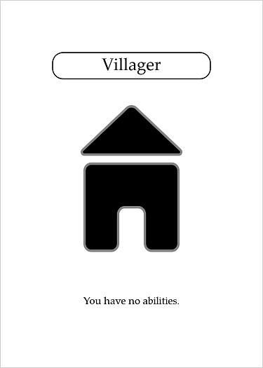
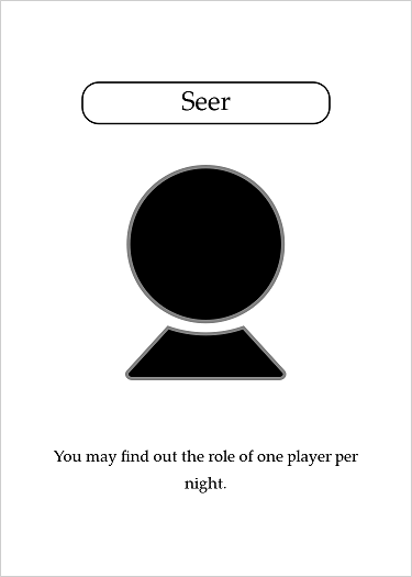
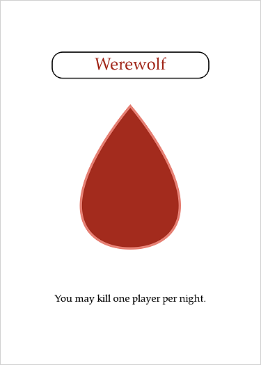
Neat! This final card is included with the CLS Renderer in the example folder, so take a look at that if you haven’t been following along.
Warning
The example included with the renderer includes an issue, specifically the font sizes are too big. Until that’s fixed, you should copy and paste the code above.